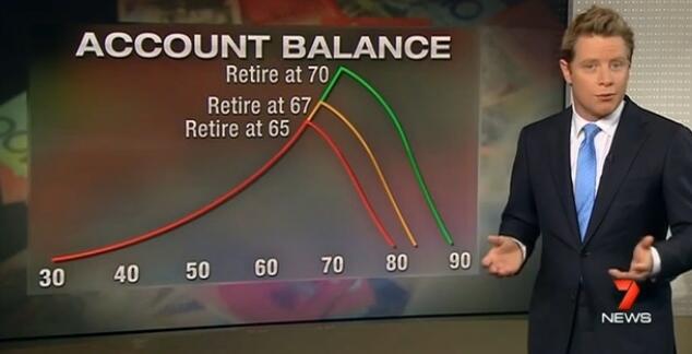

Over 13 years of writing about pensions the graph below is one I have barely seen, but over the last few weeks it has popped up three times.
Twice it was used to illustrate post-retirement product innovation and once on TV to illustrate a point about the benefits of people retiring at 70 instead of 65, (graph below created by Deloitte).

Its rarity has much to do with there being close to 1000 accumulation funds fighting for the public’s attention, but few post-retirement options. Its most common usage has been in one-on-one chats with financial advisers to create tailored retirement solutions and in online retirement calculators, but it surely should be more widely seen as a health warning for investors and as a reality check for super fund reps.
One of its most powerful uses of late was in a Plato Investment Management and Milliman presentation showing the impact of a GFC on an individual close to retirement (red line) and an individual in their 30s (yellow), see below.
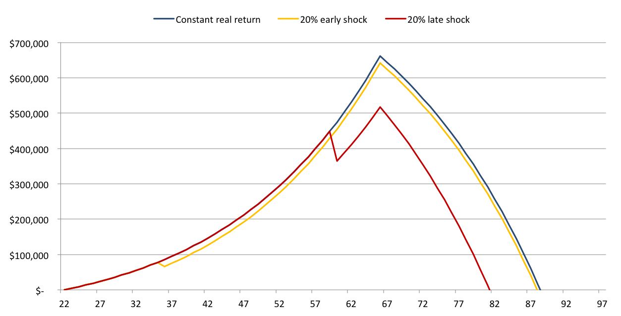 Plato Investment Management is using this slide, entitled ‘Sequency risk: what if you lose 20% in a year?’, to help explain how it could stretch the longevity of account balances in retirement. It has teamed up with Milliman to create a strategy that is awaiting ASIC approval in the next week or two. Plato will manage the equities and Milliman will use futures contracts traded on electronic platforms to reduce losses in sustained adverse market environments, such as in 2007-2009. The strategy will take the edge off maximum potential returns, but will avoid the worst of market downturns that some members never recover from.
Another popular use for such graphs is to sell the worth of deferred annuities or innovative insurance that kicks-in at the age of 80, or the point at which an individual’s fund is predicted to fall to zero. Those who saw the inspirational Canadian academic Moshe Milevsky talk in Sydney two weeks back would have seen this graph used to help explain a notional insurance product called a return contingent lifetime annuity – which pays out if your fund underperforms a pre-determined benchmark at an age mid-way through retirement. Another use is to determine the age at which a deferred annuity should pay out, or for alternative forms of longevity insurance, which pay out at age 80.
As a relative non-expert in investments and actuarial estimates of retirement income I always find it encouraging if a new concept can be understood at the first time of telling. And when it begs the question of why it is not already in common usage? Chances are, the public will see such graphs the same way too.


Leave a Comment
You must be logged in to post a comment.